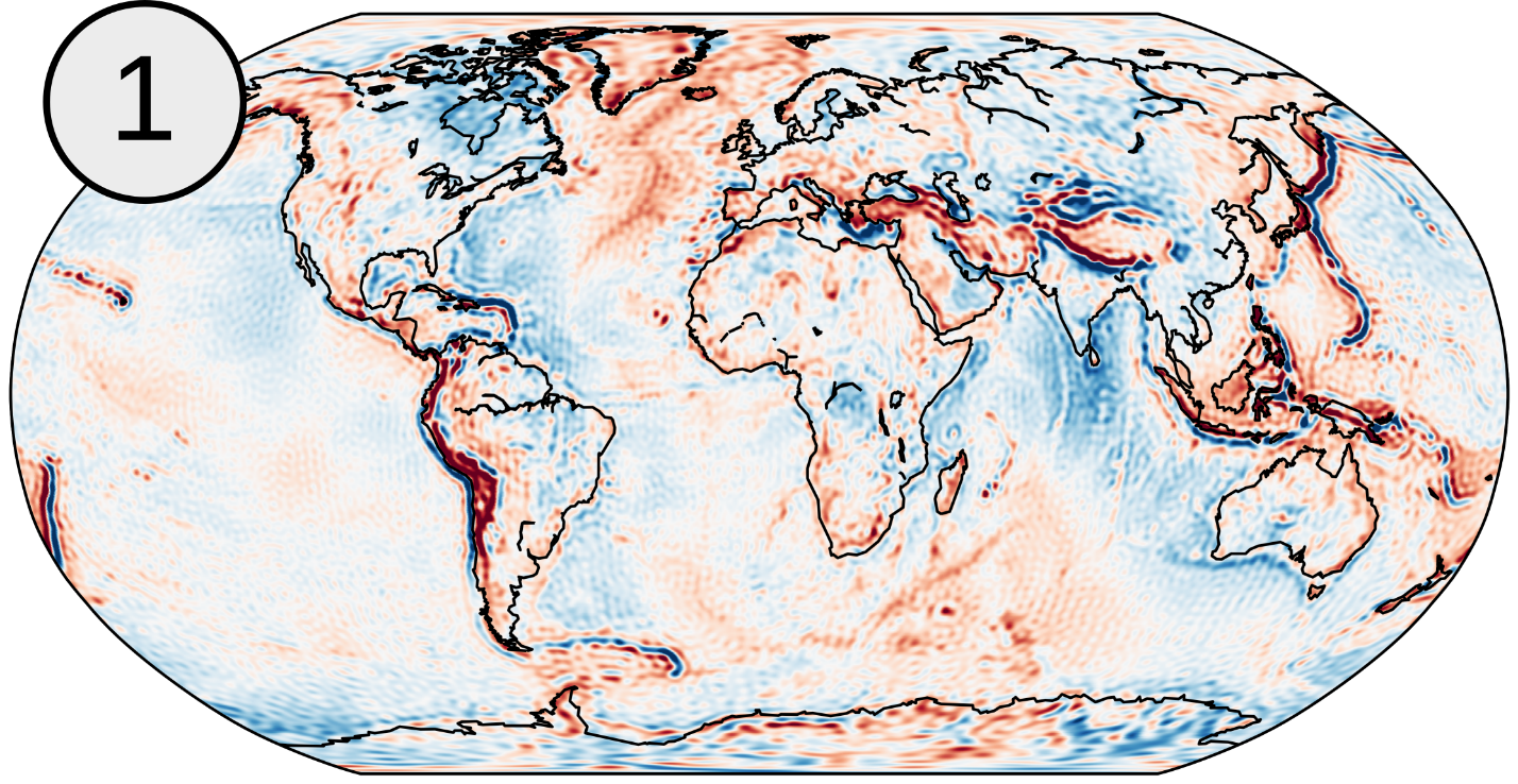
As you may have already discovered from the previous blog entries on the EGSIEM site, the Earth’s gravity field is a fascinating thing. Since gravitation itself is a pretty abstract concept, one might ask how do we actually visualize our gravity field solutions. Some representations like gravity maps (Figure 1)

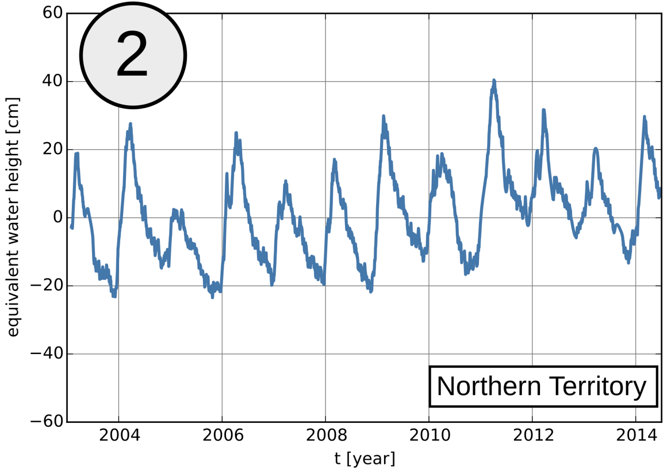
might already be familiar to you, but there are a variety of other possibilities of how a gravity field solution can be visualized. Each of these representations offers different insights and may reveal important information. When dealing with temporal variations in the Earth’s gravity field, naturally its evolution in time is of major interest. Snapshots of temporal variations such as monthly or daily gravity field solutions can be visualized as time series for specific points or as mean values for whole river areas (Figure 2).

This allows the comparison with in-situ observations like gauge measurements or displacement time series from GPS.
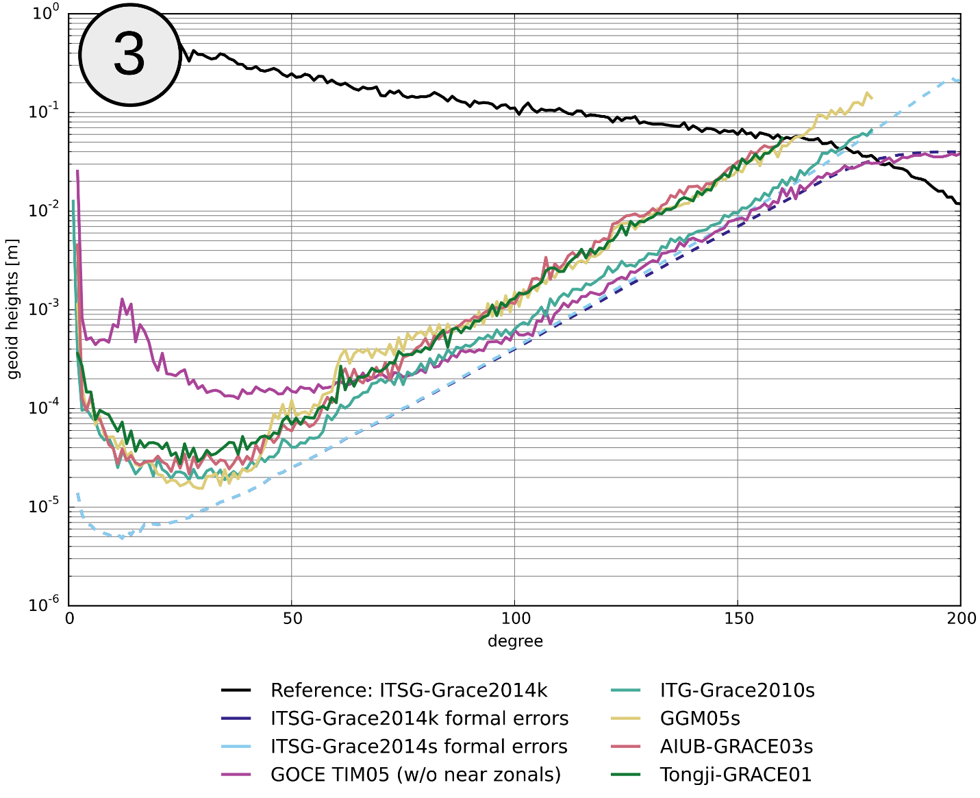
In addition to visualizing a gravity field solution in the spatial domain as a map, one can look at it in the spectral domain as degree amplitudes (Figure 3).

Simply put, these graphs show how much signal (or noise) lies within a given frequency band. Each degree on the x-axis represents a spatial wavelength, for example degree 10 corresponds to about 3800km and degree 100 to about 400km. This means that low degrees correspond to large spatial features, whereas high degrees correspond
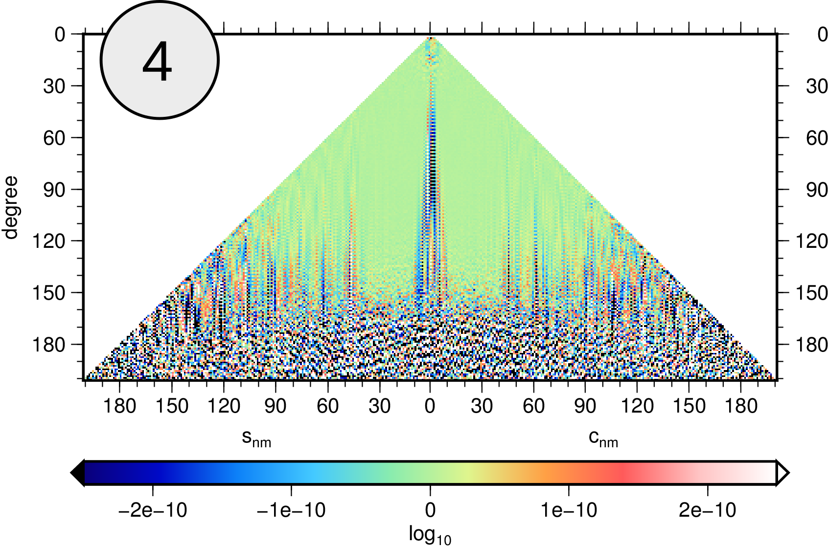
to fine structures in the gravity field. Staying in the frequency domain, each spherical harmonic coefficient (which are the parameters that describe a gravity field) can be plotted individually. The triangle form stems from the fact that each coefficient is associated with either a cosine (right half) or sine (left half) function. Figure 4 shows the difference between two gravity field solutions,

highlighting their individual features.
Some of the representations listed above are implemented in the EGSIEM plotter, so check it out!
